I’m a big fan of unique charting styles and I avoid using the default matplotlib style whenever possible, as I find it boring and soleless. This preference is not limited to charts, and I also like the hand-drawn styles for fonts and diagrams (excalidraws is a fantastic tool that I use frequently). The hand-drawn style is especially useful when presenting a proof of concept idea.
Something very interesting that I’ve recently stumbled upon is an xkcd
chart style for matplotlib
. This is a fantastic style that I can see myself using frequently going forward. All you need to do is add plt.xkcd() to your existing matplotlib code.
I played around with this style and generated a few examples. Note that currently there is an issue
that causes matplotlib to print a hundred lines of warnings when using the xkcd style, but you can get rid of them by disabling matplotlib.font_manager warnings.
Examples
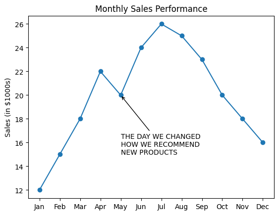
Let’s first see what our chart would look like out of the box if we used the default matplotlib style:
import matplotlib.pyplot as plt
import numpy as np
import logging

logging.getLogger("matplotlib.font_manager").disabled = True

## some dummy data
months = ["Jan", "Feb", "Mar", "Apr", "May", "Jun", "Jul", "Aug", "Sep", "Oct", "Nov", "Dec"
]
sales = [12, 15, 18, 22, 20, 24, 26, 25, 23, 20, 18, 16]

## our plot
plt.plot(months, sales, marker="o", linestyle="-")
plt.title("Monthly Sales Performance")
plt.ylabel("Sales (in $1000s)")
plt.annotate(
        "THE DAY WE CHANGED\nHOW WE RECOMMEND\nNEW PRODUCTS",
        xy=("May", 20),
        arrowprops=dict(arrowstyle="->"),
        xytext=("May", 15),
    )
plt.show()
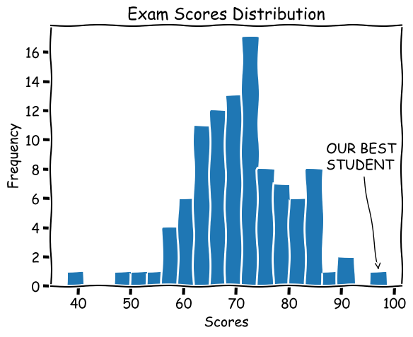
What if we use the xkcd style?
## our plot
plt.xkcd() ## just add this line
plt.plot(months, sales, marker="o", linestyle="-")
plt.title("Monthly Sales Performance")
plt.ylabel("Sales (in $1000s)")
plt.annotate(
        "THE DAY WE CHANGED\nHOW WE RECOMMEND\nNEW PRODUCTS",
        xy=("May", 20),
        arrowprops=dict(arrowstyle="->"),
        xytext=("May", 15),
    )
plt.show()
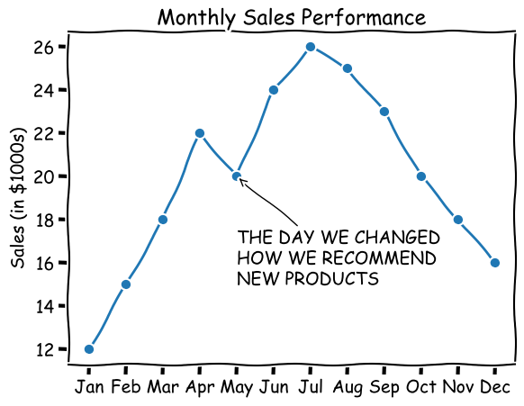
Much better in my opinion. Let’s see a few other examples:
import random
random.seed(10)
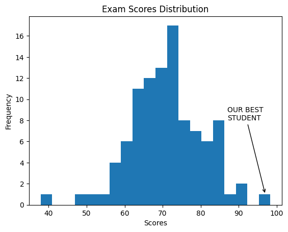
exam_scores = [
random.normalvariate(70,10,)
for _ in range(100)
]
plt.xkcd() ## default vs xkcd
plt.hist(exam_scores, bins=20)
plt.title("Exam Scores Distribution")
plt.xlabel("Scores")
plt.ylabel("Frequency")
plt.annotate(
"OUR BEST\nSTUDENT",
xy=(97, 1),
arrowprops=dict(arrowstyle="->"),
xytext=(87, 8),
)
plt.show()
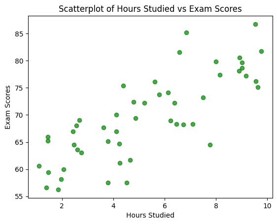
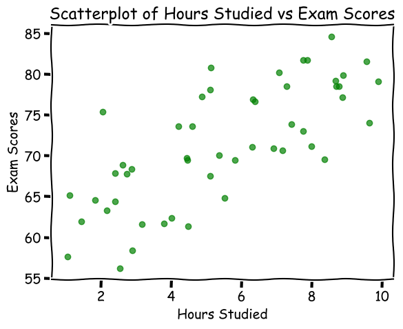
hours_studied = [random.uniform(1, 10) for _ in range(50)]
exam_scores = [60 + 2 * hours + random.normalvariate(0, 5) for hours in hours_studied]

plt.xkcd() ## default vs xkcd
plt.scatter(hours_studied, exam_scores, color="green", alpha=0.7)
plt.title("Scatterplot of Hours Studied vs Exam Scores")
plt.xlabel("Hours Studied")
plt.ylabel("Exam Scores")
plt.show()